The Hidden Zen of Headspace

INTRO

This started as my Kickass UX capstone. I came back to it a year later and realized the first version was a visual refresh that never solved the actual problem. This version does.

Role

UX Designer

UX Researcher

Type

Mobile

Solo project

Health & wellness

Tools

Figma

FigJam

Lyssna

Problems

People open search with a feeling, not a title.

Explore still makes them sort categories first.

Too many taps, and recommendations that do not match the day.

Solutions

Search now takes plain words.

One question, only when the query is unclear.

A close match instead of an empty screen, and a safety branch if the words point to distress.

Results

6/6 finished without help.

6/6 preferred the new search.

About 11 seconds to a result.

Final screens

Say it in your own words

Say it in your own words

People rarely open the app knowing the exact title they want. They open it with a feeling. So I made search a place to say that feeling out loud, in plain words, and get met right where they are.

People rarely open the app knowing the exact title they want. They open it with a feeling. So I made search a place to say that feeling out loud, in plain words, and get met right where they are.

Pain-free searching

Pain-free searching

You type the messy thing. “I can’t sleep.” The app answers with three sessions you can start, not a grid of categories. If none of them fit, Tell me more asks one follow-up. Browse is still there. The search does not dead-end, and it does not make you sort the library first.

You type the messy thing. “I can’t sleep.” The app answers with three sessions you can start, not a grid of categories. If none of them fit, Tell me more asks one follow-up. Browse is still there. The search does not dead-end, and it does not make you sort the library first.

The Process

The problem

The problem

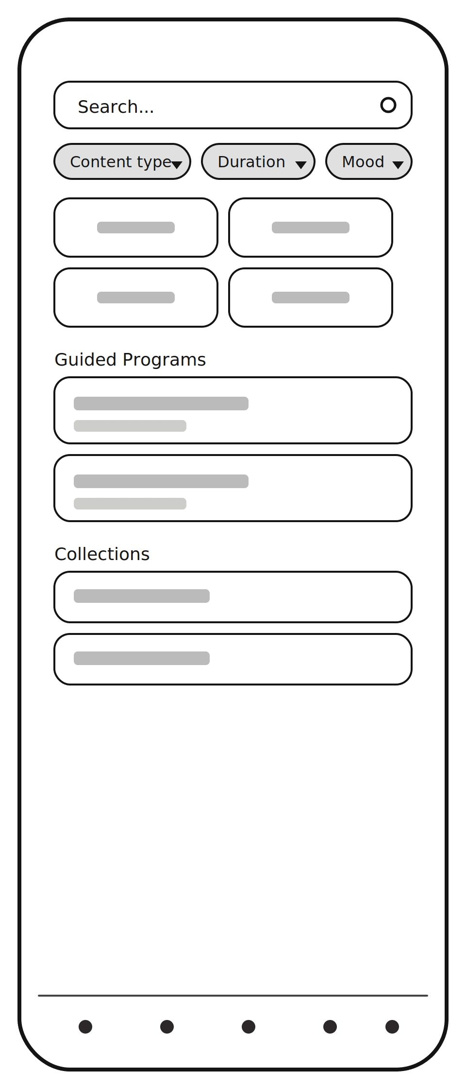
The library was not the problem. Explore has picked up a lot of weight. Category tiles, featured collections, guided programs, locked rows. Fine if you already know the title.

The library was not the problem. Explore has picked up a lot of weight. Category tiles, featured collections, guided programs, locked rows. Fine if you already know the title.

What people kept running into

Method: Affinity Diagram

I grouped feedback into an affinity map. The same few things showed up: too much scrolling, no useful filters, recommendations that didn’t match how someone felt that day, and too many taps to reach a simple tool. The library wasn’t the issue. Finding the right thing in it was.

How might we make it easier for users to discover and engage with content in Headspace?

Honorable Mentions

Method: Lo-fi wireframes

I used a "filter" approach using the "Explore" feature of Pinterest as well as a "re-design" of the entire page. Each was successful at solving part of my problem; however, both added their own "friction", ultimately leading me to design search from the ground-up.
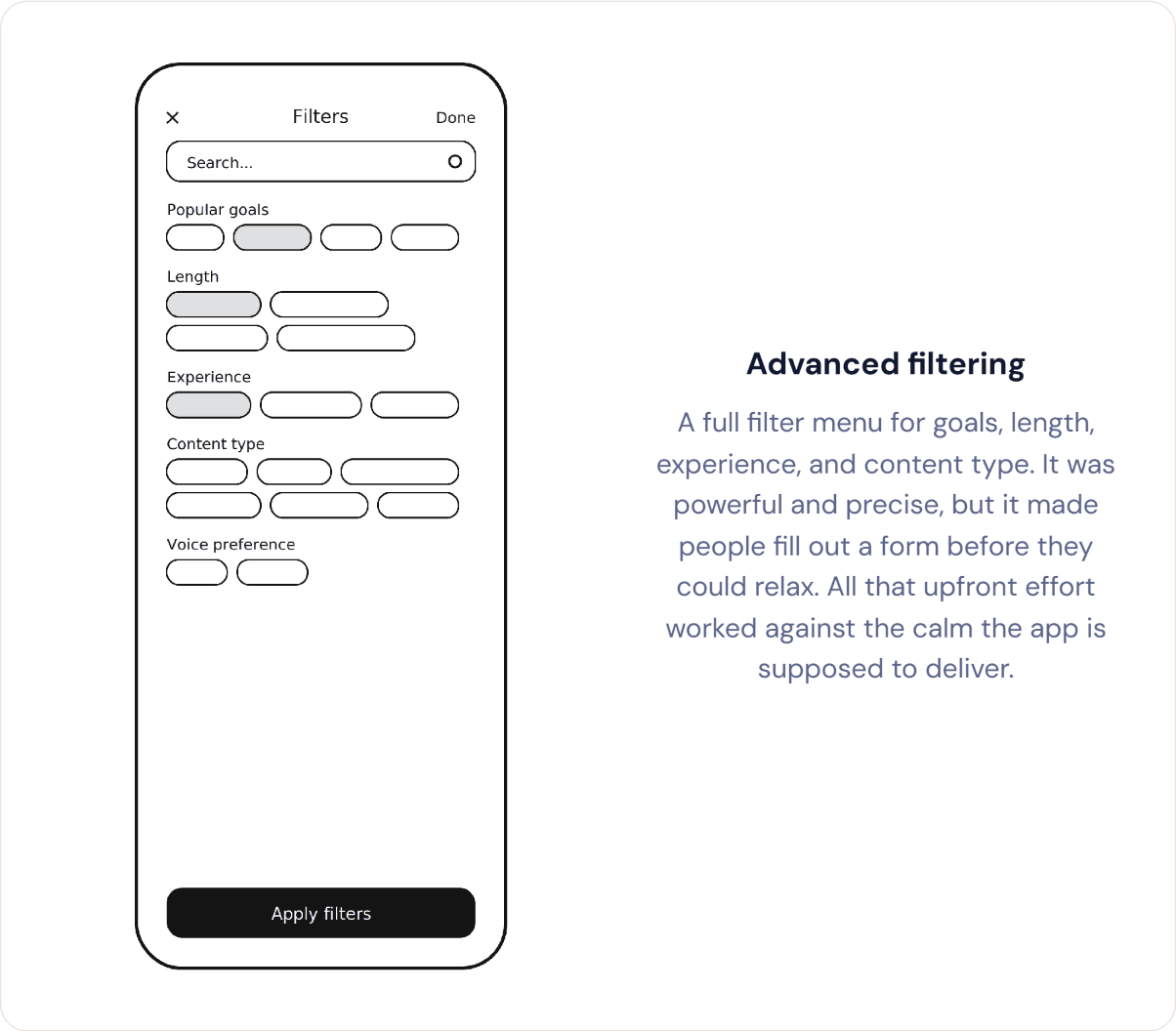
Advanced filtering

A full filter menu for goals, length, experience, and content type. It was powerful and precise, but it made people fill out a form before they could relax. All that upfront effort worked against the calm the app is supposed to deliver.

Chip-style filtering

A lighter approach using quick filter chips at the top of Explore. Faster than the full menu, but it still asked people to make several choices before anything happened. Too many small decisions stacked up before the calm could begin.

Ambient Explore

The page quietly reshaped itself based on time of day and past habits, with zero input needed. It was the lowest-effort idea by far, but also the most invisible. People couldn't tell they were being helped, so it never felt like a real feature.

Feeling-first collections

Instead of adding anything, this reorganized all of Explore around feelings like "can't switch off" or "winding down." It solved the grouping problem well, but it meant rebuilding the tab's entire structure, too big a lift for the project's scope and timeline.

The pattern that emerged was this: every option either added effort or hid the help. That is what led to the direction in the next section.

The pattern that emerged was this: every option either added effort or hid the help. That is what led to the direction in the next section.

The pattern that emerged was this: every option either added effort or hid the help. That is what led to the direction in the next section.

No dead ends

Method: Flow Diagram

I mapped the flow after the Explore ideas fell apart. I needed a way to handle an ambiguous search, a dead end, and a potential crisis without adding a bunch of extra screens. I kept drawing the path until every typed query had a next step.

Say it, don't hunt for it

Natural language replaces category browsing. People describe what they need instead of guessing where it lives in the app.

One question, not a form

When input is unclear, I ask a single focused question instead of guessing or showing a long list of options.

Something instead of nothing

If nothing matches well, the closest option still comes back. No one lands on an empty screen.

A safety branch, built in

If someone's words point to real distress, the flow sets meditation aside and hands them to actual support.

Getting there

Getting there

"I don’t know what to search for” appeared in nearly every cluster. The entry point accepts an unstructured query instead of requiring a category first.

"I don’t know what to search for” appeared in nearly every cluster. The entry point accepts an unstructured query instead of requiring a category first.

"I don’t know what to search for” appeared in nearly every cluster. The entry point accepts an unstructured query instead of requiring a category first.

Making sense of it

Making sense of it

Most of what someone types is specific enough to act on right away, so it goes straight to processing. But some input is genuinely ambiguous, like "I feel weird tonight." Rather than guess wrong, I added one branching question. It only fires when needed, so it never slows down the common case.

Most of what someone types is specific enough to act on right away, so it goes straight to processing. But some input is genuinely ambiguous, like "I feel weird tonight." Rather than guess wrong, I added one branching question. It only fires when needed, so it never slows down the common case.

When it doesn't go as planned

When it doesn't go as planned

Two failure modes needed different answers. When search just can't find a match, a dead end would undo the whole point of asking in plain words, so it offers the closest related content instead. When someone's words point to real distress, offering content at all would be the wrong response. That case gets pulled out of the normal flow entirely and handed to actual support.

Two failure modes needed different answers. When search just can't find a match, a dead end would undo the whole point of asking in plain words, so it offers the closest related content instead. When someone's words point to real distress, offering content at all would be the wrong response. That case gets pulled out of the normal flow entirely and handed to actual support.

Closing the loop

Closing the loop

After the session ends, a single question asks whether it helped. A quick 'Yes, better' or 'Not really' captures the answer, and tapping anywhere skips it if someone would rather not answer.

After the session ends, a single question asks whether it helped. A quick 'Yes, better' or 'Not really' captures the answer, and tapping anywhere skips it if someone would rather not answer.

Testing it for real

Testing it for real

Method: Usability Testing

I sat with six Headspace users and gave them the same task twice: find something for a specific mood on current Explore, then on this prototype. I wasn’t trying to prove the design should ship. I wanted to see if the new search was understandable, and whether it was any faster than browsing.

6/6

completed the task without help.

6/6

completed the task without help.

6/6

completed the task without help.

6/6

like the new search over the old one.

6/6

like the new search over the old one.

6/6

like the new search over the old one.

~16s

avg. time to a relevant result.

~16s

avg. time to a relevant result.

~16s

avg. time to a relevant result.

Looking back

This is the second time I’ve done this project. The version I made after my apprenticeship was mostly a visual pass. It didn’t deal with the actual problem. This one does.


The safety branch is the part I would not take to users at scale without people who know crisis design. Keyword rules are not enough.


Headspace has been adding conversational help, including Ebb. This prototype is narrower: stay in search, don’t open a chat, get to a session or to a person with as few extra steps as possible.


If it went on, I’d measure time to session, how often the clarify question appears, and what people do after “Not really.”

This has been one of the most educational projects I've worked on, and it's a little funny how as my understanding of design fundamentals grew, so did this project. I actually built a version of it once before, right after finishing my UX apprenticeship, and came back to it realizing the first pass skipped steps and never solved the core problem. This is the second, more thoughtful attempt.